Data visualisation is an effective tool for decision-making because it enables people to comprehend complex information and data patterns rapidly. Individuals can obtain insights and base judgements on the data by seeing data in a graphical format, such as charts, graphs, and maps.
Data visualisations come in a variety of formats, including bar graphs, line graphs, scatter plots, and heat maps. Each style of visualisation has advantages and disadvantages of its own, and the selection of a visualisation depends on the nature of the data being examined and the questions being posed.

The ability to reveal patterns and trends in data that may not be immediately obvious when the data is presented in a tabular format is one of the main benefits of data visualisation. This can assist people in finding possibilities, forecasting the future, and creating strategies based on the data.
Additionally, data visualisation can assist in clearly and effectively conveying information and insights to others. Because it enables people to share their results and insights with stakeholders and decision makers who might not have the same degree of technical understanding, this is particularly significant in the decision-making process.
Most popular algorithms used in data visualization for decision making
Several methods can be applied to data visualisation for decision-making, including:
Methods for Dimensionality Reduction: These algorithms assist in reducing the number of dimensions in large datasets, facilitating the visualisation of the data. Examples include t-SNE, Multidimensional Scaling (MDS), and Principal Component Analysis (PCA).
Algorithms for clustering data: By putting similar data points together, these algorithms make it simpler to spot patterns and connections in the data. K-Means, hierarchical clustering, and DBSCAN are some examples.
Decision Tree Algorithms: These algorithms aid in decision-making by dissecting complicated issues into simpler, easier-to-handle components. C4.5, ID3, and CART are a few examples.
Regression algorithms: These algorithms are frequently used in forecasting and trend analysis to anticipate events based on past data. Examples include Simple Linear Regression, Multiple Linear Regression, and Polynomial Regression.
Key Note: In decision making, the choice of algorithm depends on the type of data being analyzed and the questions being asked. It is important to choose the appropriate algorithm and use it in conjunction with effective data visualization techniques to make informed decisions.
Example of how data visualization helps in decision making
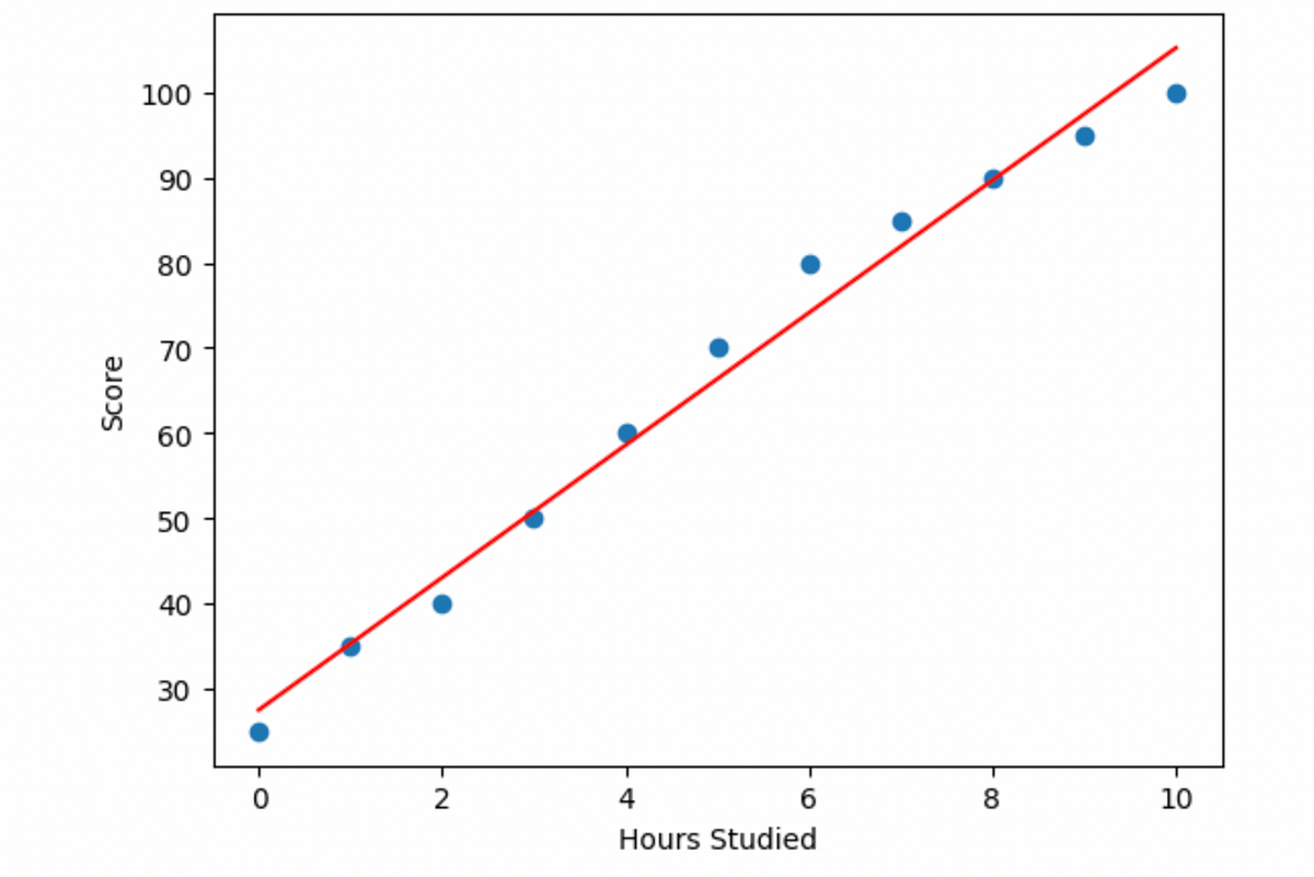
[Python] import pandas as pd import matplotlib.pyplot as plt from sklearn.linear_model import LinearRegression # Load the data into a pandas dataframe df = pd.read_csv(“/Users/akshika-vs/Desktop/DataVisualization/study_hours.csv”) # Plot the data to visualize the relationship between the variables plt.scatter(df[‘Hours Studied’], df[‘Score’]) plt.xlabel(‘Hours Studied’) plt.ylabel(‘Score’) # Fit a linear regression model to the data reg = LinearRegression().fit(df[[‘Hours Studied’]], df[‘Score’]) # Plot the regression line plt.plot(df[‘Hours Studied’], reg.predict(df[[‘Hours Studied’]]), color=’red’) plt.show() [Python]
From this visualization, we can see the relationship between hours studied and the score received, and make decisions based on the data, such as how many hours should be studied to receive a certain score.
Conclusion
In conclusion, data visualisation is an important tool in decision-making because it enables people to easily comprehend complex information, spot patterns and trends, and effectively share insights with others.
Keep Learning Keep Growing 🥂
