MongoDB is a popular NoSQL database that organizations around the world use to store and manage large amounts of data. While MongoDB provides powerful tools for querying and analyzing data, it can be challenging to gain a comprehensive understanding of your data without visualizing it.
If you are new to MongoDB data analytics and visualization, you might be wondering how to get started. If this is the case, you’re lucky — there’s an easier way! In this blog post, we’ll cover some of the important key ways by which we can leverage MongoDB’s powerful visualization features to create charts and dashboards that make sense of our data.
Charts and dashboards are a great way to analyze and visualize the data stored in MongoDB databases. These charts can help you make better decisions, gain new insights, and optimize processes within your company. I’ll show you how to quickly create basic charts using MongoDB with a bit of setup and some coding knowledge required.
Let’s get started-
Suppose you have an e-commerce database, and it is spread over multiple collections containing thousands of documents in it. Now, if you are required to offer a dashboard with a visual representation of your data saved in MongoDB, then one of the solutions that come to our mind is to
- Create and publish a set of back-end APIs that are designed for querying your MongoDB collection.
- Select a library to make charts.
- Use the data you’ve gotten from the back end to operate on an object data model as the charting library specifies.
- Write front-end code to interact with your back-end APIs.
Now, what if I told you that we could do all the above-specified tasks by just using Charts on MongoDB Cloud, i.e., MongoDB Atlas, in just a few clicks with some additional features like
- Auto refreshing(can also be customized)
- Secured as role-based permissions are required to access
- The layout can be configurable
You would be like 🥰🤗.
Let’s now quickly jump to Atlas and begin our expedition to learn.
Sign up if you don’t have an account on Atlas or log in. Your console should look like this after creating a cluster. To create a cluster, hop on to the following link-
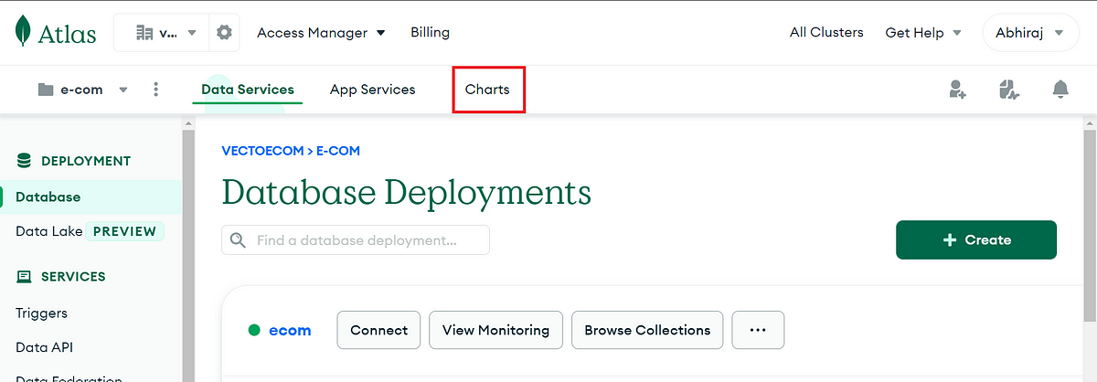
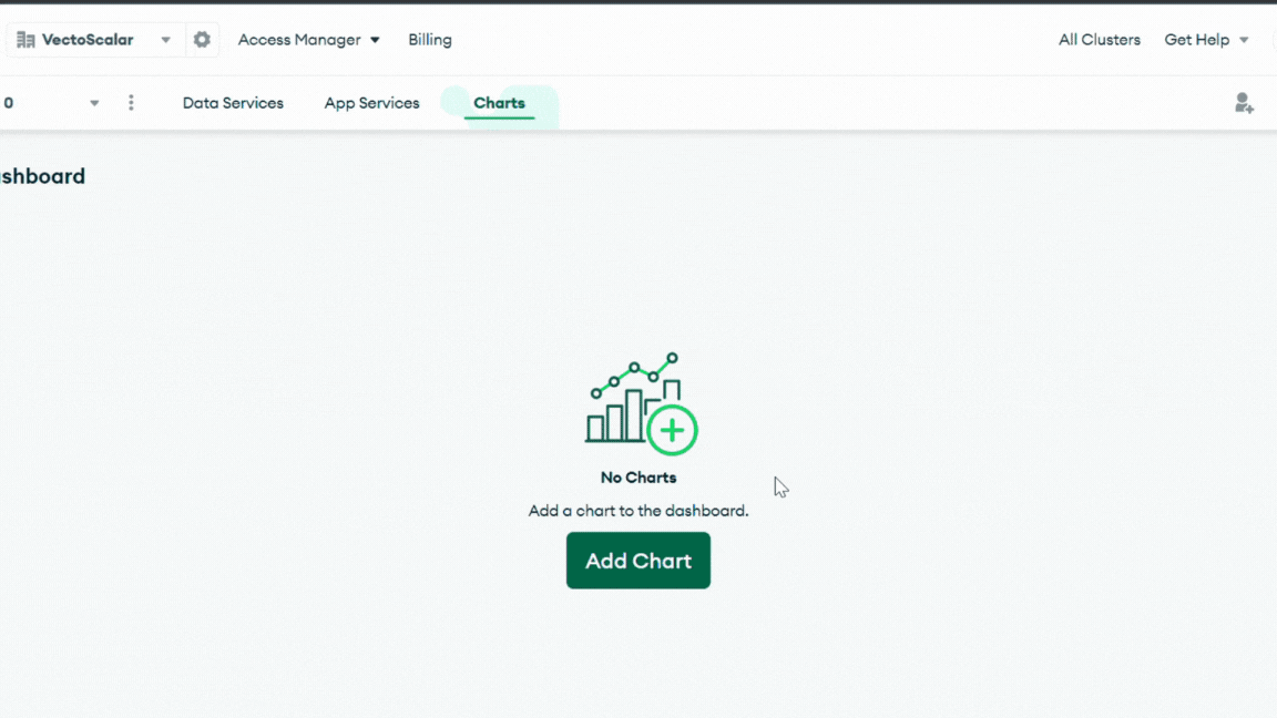
Click on Charts, and you will get land on the dashboard page with an empty dashboard already created with your username.
In most circumstances, you will already have a set of data. If you don’t have any data, then use the below link to load the sample data to Atlas.
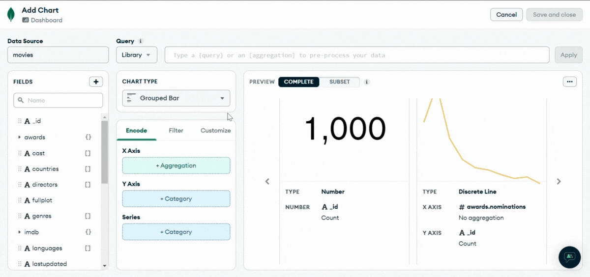
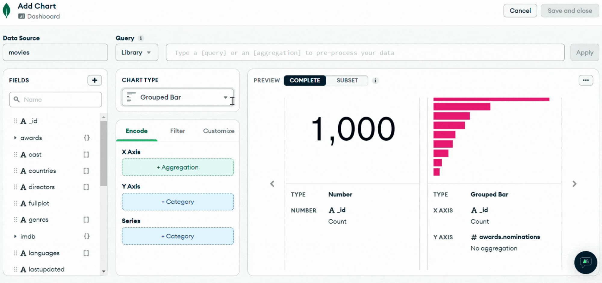
Now, let us create our first chart to display the total no. of movies we have in our collection.
We will be choosing the movie’s data source from our collections.
After selecting the movie’s data source, we will choose the chart type from the charts list.
- Choose a chart type as Number from the drop-down menu.
- Drag the field’_id’ from the fields list on the left to the aggregation column on its right.
- Apply aggregation as a count method.
- Rename the chart as No. of Movies.
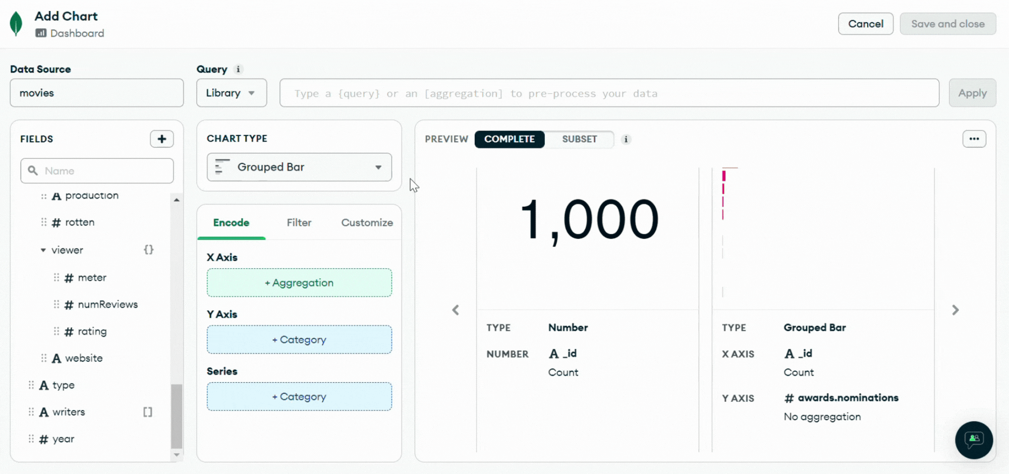
Bonus: You can also filter the chart as per the requirements. I applied the filter on the country name to give me the total no. of movies in India.
Similarly, we can make another chart for ratings of the movies. We can choose a donut type for the purpose.
Feeling Simple and Easy. I hope you have liked the warm-up. Time to buckle up ⚡⚡⚡.
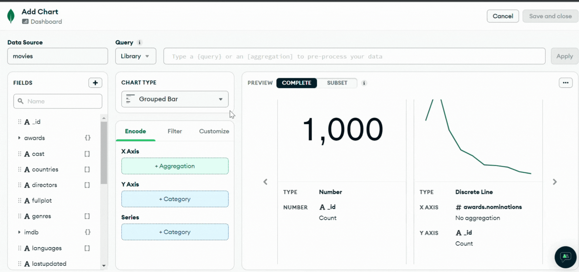
Now let’s create another chart with multiple fields. We are creating a bar chart of the Number of Movies in a Year and a line chart to show comparisons between average critic score and viewer review score. So, let us select grouped combo from the chart type.
- Select the year as X-axis from fields on the left-hand side and also bin them to 10 to make it a decade.
- Select ‘_id’ as columns and choose aggregation as count. It will create a bar chart.
- For the line chart, select the ‘meter’ field from ‘tomatoes.viewer’ and apply aggregation to mean as we need an average score in each decade.
- Repeat the above step and select the ‘meter’ field from ‘tomatoes.critic’.
- Now in the filter section, select the ‘year’ with the minimum value inclusive.
- Now plot the line chart onto the secondary axis and call it ‘rating.’
Bonus: We can also customize our charts. We can change the colors of the lines and bar, rewrite the name of the fields, and can also format the number type, and much more.
Now, let us jump to some coding parts. MongoDB charts allow you to write a query or add a missed or newly calculated field.
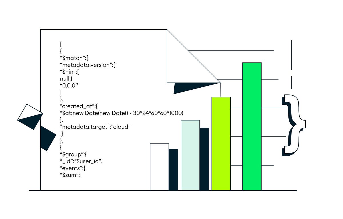
We will create a new chart, Most Prolific Actors, using a stacked bar type of chart. Here, we will be adding a new calculated field with the name ‘tomatometer,’ and the aggregation query to add the field is{
We will repeat almost all the steps stated above to create the chart. We will also limit the value to 10 results only.
We have covered almost most of our bases with the Charts. Now, let’s talk about Dashboard in MongoDB.
Dashboards are a combination of charts put together to show all of your data in one place. Dashboards are crucial for gaining insight into numerous focus points of your data in a single display because each chart uses data from a single MongoDB collection or view. Users can share dashboards with one another.
You can customize the layout of the charts, size, and position of the chart in the dashboard only. You can also place filters for the whole dashboards applicable to whole charts if they contain the same source data, or you can choose the chart to get filtered.
You can also apply role-based permissions for sharing for security reasons. Unauthenticated access can be accessed from anywhere, as authenticated access can only be accessed after verifying permissions.
Set up Dashboard permissions, following this simple documentation.
You can lock out the dashboard or share it in the organization itself.
Now comes the embedding part of the dashboard, which is one of the main features. Embedding a MongoDB dashboard into your web application can be a valuable way to provide users with an intuitive interface for interacting with the database. It can be handy for applications relying heavily on MongoDB to store and retrieve data.
You can use an iframe element to embed the dashboard into your own application. An iframe is an HTML element that allows you to embed another webpage within the current webpage. Here’s an example of how to use an iframe to embed the MongoDB dashboard:
It will display the MongoDB dashboard within an iframe element in your application. You can customize the iframe size by adjusting the width and height attributes.
One thing to remember is that the MongoDB dashboard is designed to be used as a standalone application and may not fit seamlessly into your application’s layout. You may need some styling to make the dashboard look and feel like a natural part of your application.
Another option is using MongoDB JavaScript SDK to access your application’s dashboard data directly. It requires more setup, but it allows you to thoroughly integrate the dashboard functionality into your application.
To use the JavaScript SDK, you’ll need to install it by running the following command:
import ChartsEmbedSDK from “@mongodb-js/charts-embed-dom”; const sdk = new ChartsEmbedSDK({ baseUrl: ‘https://charts.mongodb.com/charts-charts-fixture-tenant-zdvkh’, }); // embed a chart const chart = sdk.createChart({ chartId: ‘48043c78-f1d9-42ab-a2e1-f2d3c088f864’, }); // render the chart into a container chart .render(document.getElementById(‘chart’)) .catch(() => window.alert(‘Chart failed to initialise’)); // refresh the chart whenever #refreshButton is clicked document .getElementById(‘refreshButton’) .addEventListener(‘click’, () => chart.refresh()); // embed a dashboard const dashboard = sdk.createDashboard({ dashboardId: ’61d02578-6148-4c87-9cad-1fbaef50a0d3′, }); // render the chart into a container dashboard .render(document.getElementById(‘dashboard’)) .catch(() => window.alert(‘Dashboard failed to initialise’));Using the JavaScript SDK allows you to fully customize how dashboard functionality is integrated into your application. However, it requires more code and setup than an iframe and may only be suitable for some use cases.
Embedding the MongoDB dashboard into your own application is a great way to provide your users with an easy-to-use interface for managing their data. With just a few lines of code, you can bring the power of the MongoDB dashboard into your application.
Finally, charts and dashboards are essential to any analytics strategy, especially when using a document-based database. With MongoDB, there are many ways of visualizing data in charts and graphs. This collection of examples will help you leverage these features to create your own charts and dashboards with MongoDB.

Do explore more & expand with your significant use cases.
I hope you enjoyed reading & learned something new.
Don’t feel shy to appreciate with some claps.👏👏👏