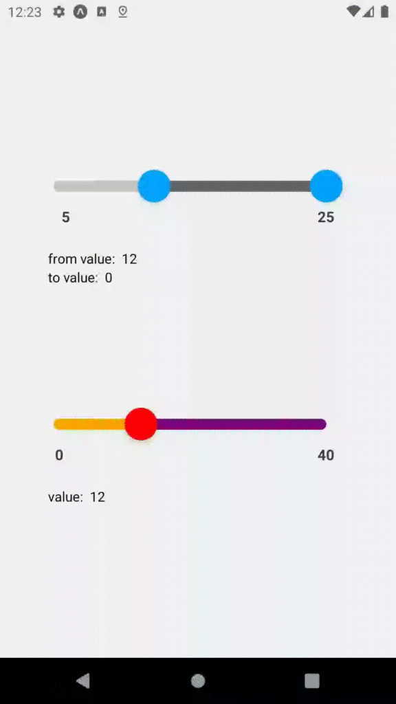
There might be some scenarios such as show distance range or proficiency of skills in which we have to use a slider. So to achieve this we can use the RangeSlider.
RangeSlider uses React Native’s Animated library to transform thumbs /label / selected rail. It is a highly optimized and fully customizable pure TS component for value range selection. The component is not re-rendered while the user moves the thumb. Only the label component is re-rendered when values are changed.
If you face any further issue, you can consider VectoScalar, one of most trusted React Native App Development Company for you react native large scale project.
Install-Package:
Using NPM:
[React Native] npm install –save rn-range-slider [React Native]Using Yarn:
yarn add rn-range-slider
Once the installation is complete, get started with the usage.
Step 1: create a slider component
DistanceSlider.tsx
import React, { useState, useCallback } from 'react';
import { ImageBackground, Text, View } from 'react-native';
import { useTranslation } from 'react-i18next';
import RangeSliderRN from 'rn-range-slider';

import { SLIDER_STEP_VALUE, TRANSLATION_PREFIX } from './constants';

import { styles } from './distanceSlider-styles';

interface IDistanceSlider {
/** distance is a required prop for default state of distance range */
distance: number;
/** startRange is a required prop that takes the initial minimum value of slider */
startRange: number;
/** lastRange is a required prop that takes the initial maximum value of slider */
lastRange: number;
/** onValueChange provides functionality to change the value of slider */
onValueChange: (value: number) => void;
}

const DistanceSlider: React.FC<IDistanceSlider> = props => {
const { distance, lastRange, onValueChange, startRange } = props;

const { t } = useTranslation();
const [distanceRange, setDistanceRange] = useState(distance);

const sliderValue = `${distanceRange}${t(`${TRANSLATION_PREFIX}.mi`)}`;
const initialValue = `${startRange}${t(`${TRANSLATION_PREFIX}.mi`)}`;
const endValue = `${lastRange}${t(`${TRANSLATION_PREFIX}.mi`)}`;

/*
*Function to render Thumb of slider
*/
const renderThumb = () => {
return (
<View style={styles.thumbContainer}>
<ImageBackground
resizeMode="stretch"
source={require('../../assets/images/notch.jpg')}
style={styles.notch}>
<Text allowFontScaling={false} style={styles.distanceText}>
{sliderValue}
</Text>
</ImageBackground>
<View style={styles.sliderThumb} />
</View>
);
};

/**
* This function Will be called when a value was changed.
*/
const handleValueChange = useCallback(
(range: number) => {
if (range >= 0) {
setDistanceRange(range);
onValueChange(range);
}
},
// eslint-disable-next-line react-hooks/exhaustive-deps
[],
);

/**
* Function to render rail for thumbs
*/
const renderRail = useCallback(() => <View style={styles.rail} />, []);

/**
* Function to render the selected part of "rail" for thumbs.
*/
const renderRailSelected = useCallback(
() => <View style={styles.railSelected} />,
[],
);

return (
<>
<View style={styles.range}>
<Text style={styles.rangeText}>{initialValue}</Text>
<Text style={styles.rangeText}>{endValue}</Text>
</View>
<View style={styles.rangeSlider}>
<RangeSliderRN
disableRange
high={distanceRange}
low={distanceRange}
max={lastRange}
min={startRange}
onTouchEnd={handleValueChange}
onValueChanged={handleValueChange}
renderRail={renderRail}
renderRailSelected={renderRailSelected}
renderThumb={renderThumb}
step={SLIDER_STEP_VALUE}
/>
</View>
</>
);
};

export default DistanceSlider;
distanceSlider-styles.ts
import { StyleSheet, ViewStyle, TextStyle, ImageStyle } from 'react-native';

import { getFontSize, heightPxToDP, widthPxToDP } from 'common/utilities';
import { AppColors, Typography } from 'theme';

import { THUMB_RADIUS } from './constants';

interface Styles {
range: ViewStyle;
rangeSlider: ViewStyle;
rangeText: TextStyle;
thumbContainer: ViewStyle;
notch: ImageStyle;
distanceText: TextStyle;
sliderThumb: ViewStyle;
rail: ViewStyle;
railSelected: ViewStyle;
}

const styles = StyleSheet.create<Styles>({
range: {
flexDirection: 'row',
justifyContent: 'space-between',
marginBottom: heightPxToDP('-6.5'),
},
rangeSlider: {
marginRight: widthPxToDP('5.5'),
marginLeft: widthPxToDP('4'),
},
rangeText: {
fontFamily: Typography.medium,
fontSize: getFontSize(14),
},
thumbContainer: { marginBottom: heightPxToDP('4.5') },
distanceText: {
alignItems: 'center',
color: AppColors.palette.black,
fontFamily: Typography.medium,
fontSize: getFontSize(14),
paddingHorizontal: widthPxToDP('2'),
paddingVertical: heightPxToDP('1'),
},
notch: { height: heightPxToDP('4.5') },
sliderThumb: {
backgroundColor: AppColors.palette.royalBlue,
borderColor: AppColors.palette.white,
borderRadius: THUMB_RADIUS,
borderWidth: 1,
height: THUMB_RADIUS * 1.5,
marginLeft: widthPxToDP('3'),
shadowColor: AppColors.palette.black,
shadowOffset: { width: 0, height: -1 },
shadowOpacity: 0.16,
shadowRadius: 6,
width: THUMB_RADIUS * 1.5,
},
rail: {
backgroundColor: AppColors.palette.concrete,
borderRadius: 2,
flex: 1,
height: heightPxToDP('0.5'),
},
railSelected: {
backgroundColor: AppColors.palette.royalBlue,
borderRadius: 2,
height: heightPxToDP('0.5'),
},
});
export default styles ;
Step 2: use this component on the screen
import React, { useState } from 'react';
import { View } from 'react-native';

import {DistanceSlider} from 'components';

const LocationSetting = () => {

const [sliderValue, setSliderValue] = useState(0);

/**
* Function to handle slider value change
*/
const handleSliderValue = (distanceValue: number) => {
setSliderValue(distanceValue);
};

return (
[React Native]
<DistanceSlider
startRange={0}
lastRange={15}
distance={sliderValue}
onValueChange={handleSliderValue}
/>
);
};

export default LocationSetting;
RangeSlider Props:
min: Minimum value of the slider
max: Maximum value of the slider
minRange: Minimum range of thumbs allowed to be selected by the user.
step: Step of the slider
low: Low value of the slider
high: High value of the slider
disableRange: Slider works as an ordinary slider with 1 control if true.
disabled: Any user interactions will be ignored if true.
renderThumb: Should render the thumb. The name is the name of the thumb.
renderRail: Should render the “rail” for thumbs. The rendered component should have flex: 1 style so it won’t fill up the whole space.
renderRailSelected: Should render the selected part of “rail” for thumbs. The rendered component should not have flex: 1 style so it fills up the whole space.
renderLabel: Should render label above thumbs. If no function is passed, no label will be drawn.
renderNotch: Should render the notch below the label (above the thumbs). The classic notch is a small triangle below the label.
onValueChanged: Will be called when a value was changed. If disableRange is set to true, the second argument should be ignored.
onSliderTouchStart: Will be called when a user starts interacting with the slider.
onSliderTouchEnd: Will be called when a user ends interaction with the slider.
Please check here if you want to know more about the RangeSlider.
Happy Coding!!😎